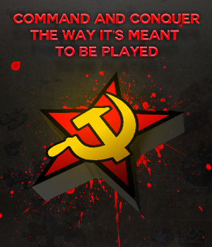
Love this design. Has aspects that made Red Alert appeal to me, that gritty old-school almost gloomy picture. Just in my opinion the font used for OpenRA and "free and open source" seem out of place. Maybe something closer to the original box font
I tried to use "C&C Red Alert INET" font but I couldn´t with Photoshop CS6, I don´t know why since it goes well with Illustrator and Word

Like it too, but... it really would need some support to tell more abour OpenRA. Guess it also really depends on what kind of image you design: a stand alone image, or an image that supports explaining text on a forumthread. In the last case the current images are good (perhaps with another font, how about Nevis?).
If you guys could also design a standalone image that still has the cleanliness of these images, but also conveys all (or the most important) information, then that be great!
Of course, this one is only an ad sketch I made (you can see some little mistakes in the ad) and I was planning to make atleast one for all the mods - some players only come to try one or two mods, I think- (Soviet tank for RA mod; GDI tank for TD and something for Dune). Maybe i´ll try changing the font to "News 706 Bold"
https://www.myfonts.com/fonts/bitstream/news-706/bold/ because it´s pretty similar to the font used in front page

about the name openra itself and the logo, which pretty much sounds and looks like red alert ( Suprised ), i think it isnt the best choice, since this project already contains 3 mods and hopefully 2 more in the future. its maybe worth thinking about something that covers all the mods.
Yeah, I´m brainstorming it to capture all emotions
Did you design that tesla tank by yourself?
Nope, I actually recycled that tesla tank from the Red Alert Retaliation intro for PSX (ahh my childhood) as you can see it here, it´s the same model. I used mirror, some HD background, a tree, and special lighting to make it more Red Alert-ish. GG.
Video:
https://www.youtube.com/watch?v=6-DAoK20ViQ