Page 3 of 5
Posted: Wed Jan 04, 2017 2:19 pm
by JOo
--
Posted: Wed Jan 04, 2017 3:47 pm
by noobmapmaker
Toying with the idea of a digital world that becomes reality. Again: everybody feel free to take this idea and make it better.
Edit: The old C&C games also seem to mix earthly factions and weapons with a futuristic/Sci-Fi twist.


Posted: Wed Jan 04, 2017 5:29 pm
by klaas
noobmapmaker wrote: ↑
OpenRA - EyE? ElitE? EnginE?

See, it's not so hard!
I'm not offended if you don't like it. I'm well aware that design isn't something you just pull out of a hat, it takes quite a bit of skill and effort to make something look nice. I honestly think the tank is going to be hard to beat in this aspect. However, another important asset of a logo is it's recognizability. I think it's this aspect that _could_ disfavor the tank. My OpenRA logo might be better in this regard, since you will remember the headache every time you see it again

Posted: Wed Jan 04, 2017 5:37 pm
by Fortnight
What about just being the tank and have the back half of it materialize from nothing? Fade into visibility towards the front, with some sparks at the back or something. Fade from nothing to a blueprint to a tank?
It might bring thoughts both to RTS and creation, with less focus on creation (people that just want to play their favorite game won't think "ok now ill start the engine" when they see the icon, they will think "ill start the game").
As for the earth globe, skip it I say. It makes it look like a game about tanks and not a game that has tanks in it.

Sounds strange but that's how it feels to me, the earth is bigger than the tank. Maybe the game "world of tanks" would be interested?
Also when you shrink that logo down to 32x32 it will just be a globe with a dot on top of it. While true that you can have different graphics for different sizes I'd prefer to have exactly one single graphic that works for all sizes, with more or less details for bigger and smaller.
Re: -please close-
Posted: Thu Jan 05, 2017 6:07 am
by anjew
Posted: Thu Jan 05, 2017 1:38 pm
by Mortecha
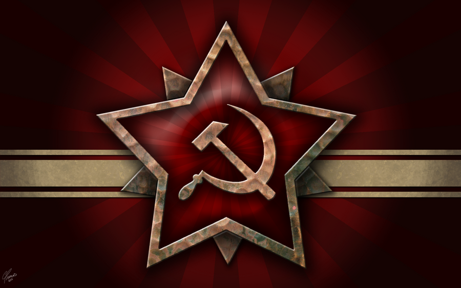
While you are chasing something that's faction neutral. The name of the game is "OpenRA", any association to Red Alert would be the hammer and sickle regardless of the games built with it's engines. If you want a neutral logo, you would have to change it's name to OpenC&C or something..
Why not keep it simple and use something from RA, can't remember if this was the game's logo but:


If not this, then remember to choose something that's really simple, and identifiable. There is no need to have OpenRA in it.
Would also recommend making it as a vector so that the many different sizes that will be required can be made with the same source.
I am also a huge fan or Aro's logo he made years ago, and have sometimes considered using it for a mod. While it is abit more complicated, a simplified version of it would be perfect. A combination of these two examples may be worth exploring.

Or perhaps even take inspiration from Erastus's works, also made years ago and another fine example to play around with.
Edit: Added reference to Aro's work
Edit: Added reference to Erastus Mercy's work
Posted: Thu Jan 05, 2017 2:20 pm
by Doomsday
Replace sickle with a wrench?
That way the logo would be
-simple
-wrench representing modding part of OpenRA
-sweet spot between being recogniciable for fans of Red Alert and being faction neutral.
Posted: Thu Jan 05, 2017 2:54 pm
by noobmapmaker
I was thinking about replacing the the sickle for the "Enginewheel" and the hammer with a gun. Will try to make a rough photoshop thingie.
Here's another concept. Not really happy about it, because this makes it look like some tank-app. But it might inspire someone to make something better.

Posted: Thu Jan 05, 2017 3:27 pm
by noobmapmaker
F*cking ugly but again conceptualizing. I wanted to step away from the star and I searched for medals. Lots of crazy shaped medals that give the "army-feeling" and that are not a star. I took one with laureates.
the logo is a cogwheel + assault rifle. What I hoped for was something that reminds you of soviets, but is not the actual hammer and sickle. The soviets are just one faction of one mod so taking them as THE logo is a bit odd.
But the Soviets do have that nice mystery of being an earthly army with lots of mysterious weapons and technologies, which to me is part of the OpenRA feeling.

Posted: Thu Jan 05, 2017 10:28 pm
by Materianer
noobmapmaker wrote: ↑
I really like this one, it fits because openra is played all over the world and the tank is modneutral.
Good work @noobmapmaker if i had a vote i'd choose this one.
Posted: Fri Jan 06, 2017 6:21 am
by Blackened
Materianer wrote: ↑noobmapmaker wrote: ↑
I really like this one, it fits because openra is played all over the world and the tank is modneutral.
Good work @noobmapmaker if i had a vote i'd choose this one.
ditto
Posted: Fri Jan 06, 2017 7:57 am
by noobmapmaker
Thanks! But... it is very detailed and if it's like this then it does put alot of ocus on the RA part. Whereas we want to say that OpenRA is much more than Red Alert.
But perhaps someone who is better at designing logo's take the gist and come up with something that conveys the message better AND is more practical in use on several sizes and platforms?
Here's a paint thingie I've made. The main idea: take the 'skyline' of the OpenRA letters and do something with it. In this case I've added kalshnikov stuff to make a gun out of it. But obviously it can be used in many more ways to incorporate the name into the logo.
Posted: Fri Jan 06, 2017 8:35 am
by hotze
noobmapmaker wrote: ↑
Here's a paint thingie I've made. The main idea: take the 'skyline' of the OpenRA letters and do something with it. In this case I've added kalshnikov stuff to make a gun out of it. But obviously it can be used in many more ways to incorporate the name into the logo.
That looks like an opensource logo for the IRA.
Posted: Fri Jan 06, 2017 8:54 am
by noobmapmaker
Another concept/idea: a logo that communicates the many layers that together make OpenRA.

This thing also conveys that feeling a bit:

Or this thing:

Posted: Fri Jan 06, 2017 10:54 am
by noobmapmaker
hotze wrote: ↑noobmapmaker wrote: ↑
Here's a paint thingie I've made. The main idea: take the 'skyline' of the OpenRA letters and do something with it. In this case I've added kalshnikov stuff to make a gun out of it. But obviously it can be used in many more ways to incorporate the name into the logo.
That looks like an opensource logo for the IRA.

I'd like to emphasize that the things Im making are not standalone suggestions for logo's, but rather ideas/concepts. i hope that better graphic designers can take the concept and make an actual logo from them.